How to make a website mobile friendly

Dan Counsell · Founder of Realmac SoftwareUpdated
We’ve made RapidWeaver, a website builder for Mac, since 2004. Each guide works with any tool, then shows how in RapidWeaver Elements.
More than half of web visits come from phones. If your site is hard to read on one, most visitors leave before they see what you do, and Google ranks sites by how their mobile version works.
What is responsive web design?
A responsive site uses one set of pages that change shape to fit the screen. Three columns on a laptop become one column on a phone. The menu folds into a button. Images shrink to fit.
The changes happen at breakpoints: screen widths where the layout switches. Common breakpoints sit around 640, 768, 1024 and 1280 pixels wide.
How to make a website mobile friendly
Add the viewport tag. Without this line in the page’s
<head>, phones show a shrunken desktop page:<meta name="viewport" content="width=device-width, initial-scale=1">Design for the phone first. Start with one column, then add columns as the screen gets wider. It’s easier than squeezing a desktop layout down.
Use flexible widths. Percentages and max widths, not fixed pixel widths that overflow small screens.
Keep text readable. Body text of at least 16 pixels, with enough space between lines.
Make things easy to tap. Buttons and links around 44 pixels high, with space between them.
Resize images. Don’t send a 4,000-pixel photo to a phone. Export sensible sizes, and use modern formats such as WebP.
Simplify the menu. A short menu, or a menu button on small screens.
Avoid pop-ups that cover the page on phones. Google counts these against you too.
How to test a mobile site
- On a real phone. Nothing beats it. Scroll every page and tap every button.
- In your browser. Safari’s Responsive Design Mode (Develop menu) and Chrome’s device toolbar show common screen sizes.
- With Lighthouse. In Chrome’s developer tools, it scores performance and flags small text and tap targets.
Mobile-friendly sites in RapidWeaver Elements
RapidWeaver Elements builds every site responsive from the start. It’s built on Tailwind CSS and works mobile-first.
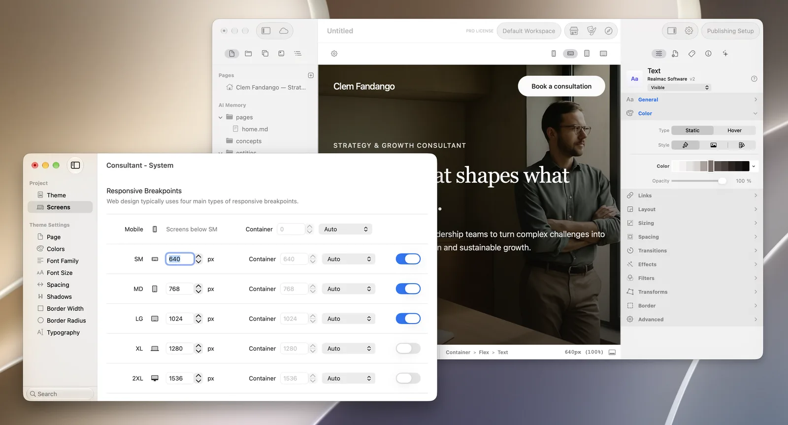
- Switch between screen sizes in the editor (Mobile, SM, MD, LG, XL and 2XL) and see the layout change as you design.
- Change a setting for one size and up: click the dot beside a control in the Inspector, and it applies from that breakpoint upwards.
- Set your own breakpoint widths in Theme Studio > Screens, and turn off the sizes you don’t need.
- Preview on your phone over your local network by scanning the QR code in the advanced project settings.
Questions about mobile-friendly websites
How do I check if my website is mobile friendly?
Open it on your phone first. Then run Lighthouse in Chrome, which flags common mobile problems. Google Search Console also reports pages with mobile issues once your site is added.
What’s the difference between responsive and adaptive design?
Responsive layouts stretch and reflow smoothly at any width. Adaptive designs switch between a few fixed layouts. Responsive is the usual choice today.
Do I need a separate mobile website?
No. Separate mobile sites, like m.example.com, are out of date. One responsive site is easier to look after and better for search.